Introduction
Simply-UI is a collection of components which are built in pure HTML and CSS.
In each component section, code snippet has the code of the actual example which is shown above the code snippet.
Installation
To use the pre-made classes import main CSS file and for icons import fontawesome icon file as per shown below.
<link rel="stylesheet" href="/CSS/global.css"> <link rel="stylesheet" href="https://cdnjs.cloudflare.com/ajax/libs/font-awesome/6.0.0-beta3/css/all.min.css" />
Alert
Alert lets you monitor any website (or specific parts of it) you wish in order to be notified when it's updated.
Simple alerts
These alerts are alerts that has specific colors for specfic event.
Simple information alert - check it out
Simple secondary alert - check it out
Simple success alert - check it out
Simple danger alert - check it out
Simple warning alert - check it out
<div class="simple-alert exp-border"> <p>Simple alerts</p> <div class="alert is-alert-info"> <p>Simple information alert - check it out</p> </div> <div class="alert is-alert-secondary"> <p>Simple secondary alert - check it out</p> </div> <div class="alert is-alert-success"> <p>Simple success alert - check it out</p> </div> <div class="alert is-alert-danger"> <p>Simple danger alert - check it out</p> </div> <div class="alert is-alert-warning"> <p>Simple warning alert - check it out</p> </div> </div>
Alerts with link
Alerts that give event message with link for that what to do next.
Information alert with link - check it out
Secondary alert with link - check it out
Success alert with link - check it out
Danger alert with link - check it out
Warning alert with link - check it out
<div class="link-alert"> <p>Link alerts</p> <div class="alert is-alert-info"> <p> Information alert with link - <a href="#" class="alert-link">check it out</a> </p> </div> <div class="alert is-alert-secondary"> <p> Secondary alert with link - <a href="#" class="alert-link">check it out</a> </p> </div> <div class="alert is-alert-success"> <p> Success alert with link - <a href="#" class="alert-link">check it out</a> </p> </div> <div class="alert is-alert-danger"> <p> Danger alert with link - <a href="#" class="alert-link">check it out</a> </p> </div> <div class="alert is-alert-warning"> <p> Warning alert with link - <a href="#" class="alert-link">check it out</a> </p> </div> </div>
Alerts with icons
Icons in alert message represents the event analogy for alert.
Simple information alert - check it out
Simple success alert - check it out
Simple danger alert - check it out
Simple warning alert - check it out
<div class="icon-alert"> <p>Icon alerts</p> <div class="alert is-alert-info"> <span class="alert-icon"> <i class="fas fa-question-circle"></i> </span> <p>Simple information alert - check it out</p> </div> <div class="alert is-alert-success"> <span class="alert-icon"> <i class="fas fa-check-circle"></i> </span> <p>Simple success alert - check it out</p> </div> <div class="alert is-alert-danger"> <span class="alert-icon"> <i class="fas fa-times-circle"></i> </span> <p>Simple danger alert - check it out</p> </div> <div class="alert is-alert-warning"> <span class="alert-icon"> <i class="fas fa-exclamation-triangle"></i> </span> <p>Simple warning alert - check it out</p> </div> </div>
Avatar
Avatar represents users profile pic for logged in users on websites.
Circular avatar
It shows circular profile pic for logged in users.


<div class="avatar-container"> <div> <img class="avatar avatar-lg circle-radius" src="/Images/mrunalThakur.jpg" alt="no preview available" /> </div> <div> <img class="avatar avatar-md circle-radius" src="/Images/mrunalThakur.jpg" alt="no preview available" /> </div> <div> <img class="avatar avatar-sm circle-radius" src="/Images/mrunalThakur.jpg" alt="no preview available" /> </div> </div>
Rounded corner avatar
This is a square avatar with rounded corners.


<div class="avatar-container"> <div> <img class="avatar avatar-lg square-radius" src="/Images/mrunalThakur.jpg" alt="no preview available" /> </div> <div> <img class="avatar avatar-md square-radius" src="/Images/mrunalThakur.jpg" alt="no preview available" /> </div> <div> <img class="avatar avatar-sm square-radius" src="/Images/mrunalThakur.jpg" alt="no preview available" /> </div> </div>
Circular letter avatar
It represents the first letter as an image in your avatar.
<div class="avatar-container"> <div class="avatar avatar-lg avatar-letter"> <span class="first">G</span> </div> <div> <div class="avatar avatar-md avatar-letter"> <span class="second">G</span> </div> </div> <div> <div class="avatar avatar-sm avatar-letter"> <span class="third">G</span> </div> </div> </div>
Square letter avatar
It represents the first letter as an image with square shape.
<div class="avatar-container"> <div class="avatar avatar-lg avatar-letter square-radius"> <span class="first">G</span> </div> <div> <div class="avatar avatar-md avatar-letter square-radius"> <span class="second">G</span> </div> </div> <div> <div class="avatar avatar-sm avatar-letter square-radius"> <span class="third">G</span> </div> </div> </div>
Badges
Badges are important to show user current status, notification counts, no. of products in carts etc...
Status badges
Status badges are used to show current status of user like active, away, do not disturb and invisible.


<div class="avatar-container"> <div class="profile-area"> <img class="avatar avatar-lg" src="/Images/mrunal-thakur-2.jpg" alt="no preview available" /> <span class="avatar-badge badge-lg"></span> </div> <div class="profile-area"> <img class="avatar avatar-md" src="/Images/mrunal-thakur-2.jpg" alt="no preview available" /> <span class="avatar-badge badge-md"></span> </div> <div class="profile-area"> <img class="avatar avatar-sm" src="/Images/mrunal-thakur-2.jpg" alt="no preview available" /> <span class="avatar-badge badge-sm"></span> </div> <div class="profile-area"> <img class="avatar avatar-lt" src="/Images/mrunal-thakur-2.jpg" alt="no preview available" /> <span class="avatar-badge badge-lt"></span> </div> </div>
Status badges
Status badges are used to show current status of user like active, away, do not disturb and invisible.
<div class="icon-container"> <div class="icon-area"> <span class="material-icons-outlined icon"> shopping_cart </span> <span class="badge first">5</span> </div> <div class="icon-area"> <span class="material-icons-outlined icon"> notifications </span> <span class="badge second">7</span> </div> <div class="icon-area"> <span class="material-icons-outlined icon"> mail </span> <span class="badge third">9</span> </div> </div>
Cards
Cards are generally used in e-commerce app for showing product information.
Text only card
A card in which contents are placed in horizontal direction.
src="/Images/diffWinter.jpg" alt="No preview available" /> </div> <div class="card-body-wrapper"> <div class="card-body"> <h3 class="card-title">Book</h3> <small class="not">By John Willy</small> <p class="card-description"> I think books are like people, in the sense that they’ll turn up in your life when you most need them. </p> <p class="card-description"> I find television very educating. Every time somebody turns on the set, I go into the other room and read a book. </p> <p class="card-sell-price not"> <span>₹350</span><span class="card-cost-price">₹650</span ><span class="card-discount">50%off</span> </p> </div> </div> <div class="features not"> <a class="link-read-more" href="#">Read</a> <a class="link-bookmark" href="#">Bookmark</a> <span> <i class="far fa-heart im"></i> </span> <span> <i class="fas fa-share-alt not"></i> </span> <span> <i class="fas fa-ellipsis-v"></i> </span> </div> </div> </body> </html>
Cards with shadow
Cards have shadow effect around it.
<div class="card card-shadow"> <div class="card-image-container"> <img class="image-responsive" src="/Images/diffWinter.jpg" alt="No preview available" /> </div> <div class="card-body"> <h3 class="card-title">A line in the river</h3> <small class="not">By John Willy</small> <p class="card-description"> Think twice, write it on paper and do it in actions. </p> <p class="card-sell-price"> <span>₹325</span><span class="card-cost-price">₹650</span ><span class="card-discount">50%off</span> </p> <button class="card-button is-cart"> <span> <i class="fas fa-shopping-cart im"></i>Add to Cart</span> </button> </div> <div class="features not"> <a class="link-read-more" href="#">Read</a> <a class="link-bookmark" href="#">Bookmark</a> <span> <i class="far fa-heart"></i> </span> <span> <i class="fas fa-share-alt not"></i> </span> <span> <i class="fas fa-ellipsis-v"></i> </span> </div> </div>
Cards with badge
Cards have badge on it for its current status e.g trending, best value etc...
<div class="card"> <span class="card-badge">Trending</span> <div class="card-image-container"> <img class="image-responsive" src="/Images/diffWinter.jpg" alt="No preview available" /> </div> <div class="card-body"> <h3 class="card-title">A line in the river</h3> <small class="not">By John Willy</small> <p class="card-description"> Think twice, write it on paper and do it in actions. </p> <p class="card-sell-price"> <span>₹325</span><span class="card-cost-price">₹650</span ><span class="card-discount">50%off</span> </p> <button class="card-button is-cart"> <span> <i class="fas fa-shopping-cart im"></i>Add To Cart</span> </button> </div> <div class="features not"> <a class="link-read-more" href="#">Read</a> <a class="link-bookmark" href="#">Bookmark</a> <span> <i class="far fa-heart"></i> </span> <span> <i class="fas fa-share-alt not"></i> </span> <span> <i class="fas fa-ellipsis-v"></i> </span> </div> </div> <!-- || Card with dismissal -->
Cards with dismissal
Dismissal card have funcionality to remove card from the list.
<span class="card-dismiss"> <i class="fas fa-times im"></i> </span> <div class="card-image-container"> <img class="image-responsive" src="/Images/diffWinter.jpg" alt="No preview available" /> </div> <div class="card-body"> <h3 class="card-title">A line in the river</h3> <small class="not">By John Willy</small> <p class="card-description"> Think twice, write it on paper and do it in actions. </p> <p class="card-sell-price"> <span>₹325</span><span class="card-cost-price">₹650</span ><span class="card-discount">50%off</span> </p> <button class="card-button is-cart"> <span> <i class="fas fa-shopping-cart im"></i>Add To Cart</span> </button> </div> <div class="features not"> <a class="link-read-more" href="#">Read</a> <a class="link-bookmark" href="#">Bookmark</a> <span> <i class="far fa-heart im"></i> </span> <span> <i class="fas fa-share-alt not"></i> </span> <span> <i class="fas fa-ellipsis-v"></i> </span> </div> </div> <!-- || Card with text overlay --> <div class="card"> <div class="card-overlay">
Card with text overlay
Crads having text overlay to it to show important information about it.
<img class="image-responsive" src="/Images/diffWinter.jpg" alt="No preview available" /> </div> <div class="card-body"> <h3 class="card-title">A line in the river</h3> <small class="not">By John Willy</small> <p class="card-description"> Think twice, write it on paper and do it in actions. </p> <p class="card-sell-price"> <span>₹325</span><span class="card-cost-price">₹650</span ><span class="card-discount">50%off</span> </p> <button class="card-button is-cart"> <span> <i class="fas fa-shopping-cart im"></i>Add To Cart</span> </button> </div> <div class="features not"> <a class="link-read-more" href="#">Read</a> <a class="link-bookmark" href="#">Bookmark</a> <span> <i class="far fa-heart"></i> </span> <span> <i class="fas fa-share-alt not"></i> </span> <span> <i class="fas fa-ellipsis-v"></i> </span> </div> </div> <div class="card-overlay-text"> <span class="text-overlay">Currently Unavailable</span> </div> </div> <!-- || Horizontal card --> <div class="card card-horizontal"> <div class="horizontal-image-container">
Card horizontal
A card in which contents are placed in horizontal direction.
class="horizontal-card-image" src="/Images/diffWinter.jpg" alt="No preview available" /> </div> <div class="card-body-wrapper"> <div class="card-body"> <h3 class="card-title">A Line in the river</h3> <small class="not">By John Willy</small> <p class="card-description"> I think books are like people, in the sense that they’ll turn up in your life when you most need them. </p> <p class="card-sell-price"> <span>₹325</span><span class="card-cost-price">₹650</span ><span class="card-discount">50%off</span> </p> <div class="card-button-container"> <button class="card-button is-cart"> <span></i>Add to Cart</span> </button> <button class="card-button is-wishlist"> <span></i>Move to wishlist</span> </button> </div> </div> </div> <div class="features not"> <a class="link-read-more" href="#">Read</a> <a class="link-bookmark" href="#">Bookmark</a> <span> <i class="far fa-heart"></i> </span> <span> <i class="fas fa-share-alt not"></i> </span> <span> <i class="fas fa-ellipsis-v"></i> </span> </div> </div> <!-- || Text Only cards --> <div class="card">
Images
Images are most important for any web projects. It can be in any shape like circle or rectangle.
Responsive images
Responsive images are the images that will have some fixed height and width, and it will scale according to parent element.

<img class="image-responsive" src="/Images/bookcupboard.jpg" alt="no preview available" />
Circular image
Add snippet class to get rounded shape image.

<img class="image image-circle" src="/Images/book.jpg" alt="no preview available" />
Rounded corner image
These images have corners rounded with square shape.

<img class="image image-rounded-corner" src="/Images/book.jpg" alt="no preview available" />
Input
Input element in HTML provides user to enter usres details via built in default components.
Simple inputs
Simple textbox with input type text allows user to enter user's name, state, country etc...
<input class="input is-input-primary" type="text" placeholder="Simple primary textbox" />
Disabled text box
Text box is disabled by attaching attribute called disabled.
<input class="input is-disabled" type="text" placeholder="Disabled Text Box" disabled />
Phone number
Phone number input takes input type as tel and maxlength as 10 to enter valid phone number.
<div class="input-icon-container is-success"> <i class="fas fa-phone phone-icon"></i> <input type="tel" class="input phone-input" maxlength="10" placeholder="Phone" /> </div>
Validation success
User enters the valid username then input will give success message.
<div class="validation-success"> <div class="input-icon-container is-input-success"> <i class="fas fa-user pre-icon icon-user"></i> <input class="input username-input" type="text" placeholder="Username:" /> <i class="fas fa-check-circle icon-success"></i> </div> <span class="message success-message">Hurray! valid username</span> </div>
Validation error
User enters the invalid password then input will give error message.
<div class="validation-error"> <div class="input-icon-container is-success"> <i class="fas fa-lock pre-icon icon-password"></i> <input class="input password-input" type="password" placeholder="Password:" /> <i class="fas fa-times-circle icon-error"></i> </div> <span class="message error-message">Oops! wrong password</span> </div>
Lists
Lists are collection of similar type of items in the list form. It can be unordered or ordered list.
Un-ordered lists
Lists that has symbols to represent each list-item is un-ordered list.
- Pop OS
- Manjaro
- Endeavour OS
- Ubuntu
- Pop OS
- Manjaro
- Endeavour OS
- Ubuntu
<ul class="spaced-list-square"> <li>Pop OS</li> <li>Manjaro</li> <li>Endeavour OS</li> <li>Ubuntu</li> </ul> <ul class="spaced-list-disc"> <li>Pop OS</li> <li>Manjaro</li> <li>Endeavour OS</li> <li>Ubuntu</li> </ul>
Ordered lists
Lists that has specific number sequence or alphabet sequence or any sequence to represent each list-item is Ordered list.
- Pop OS
- Manjaro
- Endeavour OS
- Ubuntu
- Pop OS
- Manjaro
- Endeavour OS
- Ubuntu
<ol class="spaced-list-number"> <li>Pop OS</li> <li>Manjaro</li> <li>Endeavour OS</li> <li>Ubuntu</li> </ol> <ol class="spaced-list-letter"> <li>Pop OS</li> <li>Manjaro</li> <li>Endeavour OS</li> <li>Ubuntu</li> </ol>
Notification lists
Notification list is a collection of all individual notification.
- Your ordered delivered successfully
- You have used 90% of your data.
- This will harm your phone.
<ul class="stacked-list"> <li class="n1"> <span><i class="far fa-check-circle"></i></span>Your ordered delivered successfully </li> <li class="n2"> <span><i class="fas fa-info-circle"></i></span>You have used 90% of your data. </li> <li class="n3"> <span><i class="far fa-times-circle"></i></span>This will harm your phone. </li> </ul>
Modal
A modal is a dialog box/popup window that is displayed on top of the current page: Open Modal.
Login for better experience.
goodreads is like social media for book readers.
<div class="alert-modal"> <h1 class="dialog-header"> Login for better experience. </h1> <p>goodreads is like social media for book readers. </p> <div class="options"> <button class="action-button">Continue without login</button> <button class="action-button">Login</button> </div> </div>
Toast
The toast component is like an alert box that is only shown for a couple of seconds when something happens (i.e. when the user clicks on a button, submits a form, etc.).
Hurray! Successfully logged in
Oops! password is too weak
Sorry! Email is not registered yet.
<div class="toast toast-success"> <p>Hurray! Successfully logged in</p> <i class="fas fa-times close-icon"></i> </div> <!-- || Warning Toast --> <div class="toast toast-warning"> <p>Oops! password is too weak</p> <i class="fas fa-times close-icon"></i> </div> <!-- || Danger Toast --> <div class="toast toast-danger"> <p>Sorry! Email is not registered yet.</p> <i class="fas fa-times close-icon"></i> </div>
Text Utilities
Text utilities are Semantic HTML tags with different fontsize, fontweight.
Headings
I love the smell of book ink in the morning.
</div> <span class="static-rating"> <i class="fas fa-star fill"></i> <i class="fas fa-star fill"></i> <i class="fas fa-star fill"></i>
Small text
************Ends**********-->
Gray text
I love the smell of book ink in the morning.
clicks on a button, submits a form, etc.). </p> </div>
Align text
I love the smell of book ink in the morning.
<p class="align-start">I love the smell of book ink in the morning.</p> <p class="align-center">I love the smell of book ink in the morning.</p> <p class="align-end">I love the smell of book ink in the morning.</p>
Grids
Grids are basically to show your childs into grid form just like pictures in gallery, products on flipKart etc...
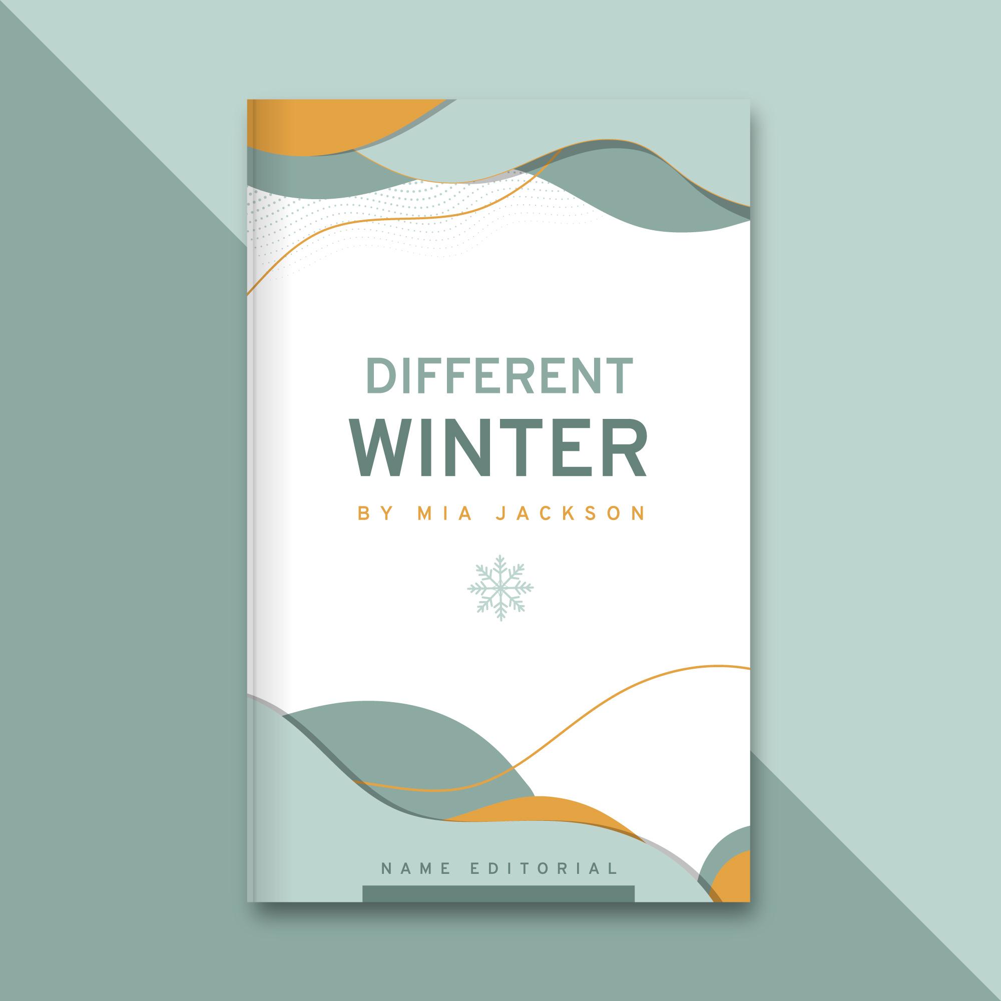
Different Winter
By Mia JacksonThink twice, write it on paper and do it in actions.
₹325₹65050%off

Different Winter
By Mia JacksonThink twice, write it on paper and do it in actions.
₹325₹65050%off
<div class="grid-2-item"> <div class="card card-shadow"> <div class="card-image-container"> <img class="image-responsive" src="/Images/lineriver.jpg" alt="No preview available" /> </div> <div class="card-body"> <h3 class="card-title">A line in the river</h3> <small class="not">By John Willy</small> <p class="card-description"> Think twice, write it on paper and do it in actions. </p> <p class="card-sell-price"> <span>₹325</span><span class="card-cost-price">₹650</span ><span class="card-discount">50%off</span> </p> <button class="card-button is-cart"> <span> <i class="fas fa-shopping-cart"></i>Add to Cart</span> </button> </div> </div> <div class="card card-shadow"> <div class="card-image-container"> <img class="image-responsive" src="/Images/lineriver.jpg" alt="No preview available" /> </div> <div class="card-body"> <h3 class="card-title">A line in the river</h3> <small class="not">By John Willy</small> <p class="card-description"> Think twice, write it on paper and do it in actions. </p> <p class="card-sell-price"> <span>₹325</span><span class="card-cost-price">₹650</span ><span class="card-discount">50%off</span> </p> <button class="card-button is-cart"> <span> <i class="fas fa-shopping-cart"></i>Add to Cart</span> </button> </div> </div> </div>
Trending

Different Winter
By Mia JacksonThink twice, write it on paper and do it in actions.
₹325₹65050%off

Different Winter
By Mia JacksonThink twice, write it on paper and do it in actions.
₹325₹65050%off
<div class="grid-3-item"> <div class="card"> <h3 class="card-badge">Trending</h3> <div class="card-image-container"> <img class="image-responsive" src="/Images/lineriver.jpg" alt="No preview available" /> </div> <div class="card-body"> <h3 class="card-title">A line in the river</h3> <small class="not">By John Willy</small> <p class="card-description"> Think twice, write it on paper and do it in actions. </p> <p class="card-sell-price"> <span>₹325</span><span class="card-cost-price">₹650</span ><span class="card-discount">50%off</span> </p> <button class="card-button is-cart"> <span> <i class="fas fa-shopping-cart"></i>Add To Cart</span> </button> </div> </div> <div class="card"> <div class="card-overlay"> <span class="card-badge">Best Value</span> <div class="card-image-container"> <img class="image-responsive" src="/Images/lineriver.jpg" alt="No preview available" /> </div> <div class="card-body"> <h3 class="card-title">A line in the river</h3> <small class="not">By John Willy</small> <p class="card-description"> Think twice, write it on paper and do it in actions. </p> <p class="card-sell-price"> <span>₹325</span><span class="card-cost-price">₹650</span ><span class="card-discount">50%off</span> </p> <button class="card-button is-cart"> <span> <i class="fas fa-shopping-cart"></i>Add To Cart</span> </button> </div> </div> <div class="card-overlay-text"><p>Currently Unavailable</p></div> </div> <div class="card"> <span class="card-badge">Best Value</span> <span class="card-dismiss"> <i class="fas fa-times"></i> </span> <div class="card-image-container"> <img class="image-responsive" src="/Images/lineriver.jpg" alt="No preview available" /> </div> <div class="card-body"> <h3 class="card-title">A line in the river</h3> <small class="not">By John Willy</small> <p class="card-description"> Think twice, write it on paper and do it in actions. </p> <p class="card-sell-price"> <span>₹325</span><span class="card-cost-price">₹650</span ><span class="card-discount">50%off</span> </p> <button class="card-button is-cart"> <span> <i class="fas fa-shopping-cart"></i>Add To Cart</span> </button> </div> </div> </div>